How I Redesigned Noise's Shopping Experience and Grew Average Order Value by 20%
Noise is one of India's top wearable brands. But their online store wasn't turning visitors into buyers. Here's how three targeted changes fixed that.
Client
Noise India's No.1 wearable brand
Year
2021
Services
E-commerce · Consumer
Role
Senior Designer. I owned the research, ideas, design, and handoff end to end.
The Problem
Noise's main customers, millennials and Gen Z, were placing smaller orders than the business expected. Many were also leaving before finishing checkout. The site wasn't guiding people toward buying, and it wasn't inspiring them to add more to their cart.
What I Did
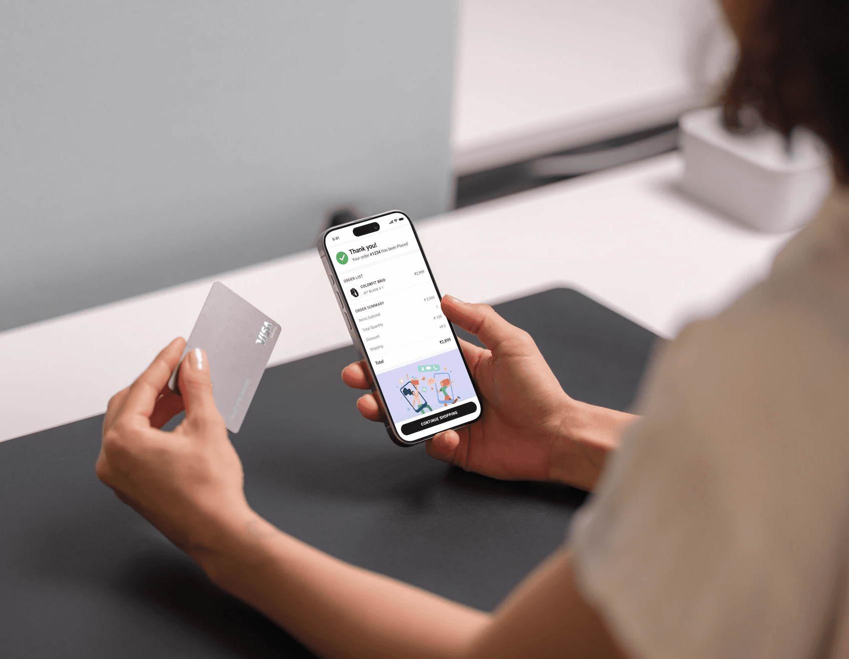
I led all design work as the senior designer on a team of two. I owned it end-to-end, the research, the ideas, the design, and the handoff to engineering, working closely with product managers, data analysts, and developers

The Impact
+20% Average order value rose from ₹3,500 to ₹4,200. More spent per order, without more traffic. +10% — Conversion went up as the journey got smoother and friction dropped. −18% — Cart abandonment fell after the redesign.
+20% Average order value rose from ₹3,500 to ₹4,200. More spent per order, without more traffic.
+10% Conversion went up as the journey got smoother and friction dropped.
−18% Cart abandonment fell after the redesign.

How I Approached It
I started with the data, not the designs. Heatmaps and clickstream analysis showed exactly where users dropped off and where the site created friction. Then I looked at what the best e-commerce brands were doing differently.

What I Learned
This project showed me why data and design have to work together. The heatmaps didn't just confirm what we suspected — they showed us things user interviews alone would have missed. And the cross-sell feature, which looked like a small design choice, turned out to be the highest-impact change we made.

What I Found
Hard to navigate: People couldn't find products quickly, the navigation was too complex.
No cross-selling: The site never suggested related products, so people didn't discover more to buy.
A clunky checkout: Too many steps and too few payment options meant people quit at the last moment.

The Biggest Decision
The data pointed at three problems, but I couldn't fix all three at once with equal effort. I had to decide where to place the biggest bet. I bet on cross-selling a feature the site didn't have at all. The safer choice would have been to just polish checkout, but that only stops people from leaving. Cross-selling actively grows each order. It was the riskier call, but the one with real upside. That bet paid off: the cross-sell feature became the single biggest driver of the 20% order-value increase.

What I Built
Three targeted changes, one for each core problem:


Conclusion
“Prasad transformed our digital commerce experience with a strong focus on measurable business outcomes. His redesign and experimentation directly improved conversion, AOV, and customer experience—making a clear impact on Noise’s growth.”

Amit Khatri
Co-Founder
Related Projects